Pop Corn Logotype
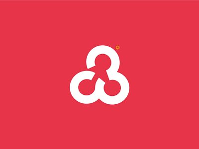
Popcorn. This food is loved by all and especially by the youngest. It is sweet or salty, and even caramel for the most greedy. This logo can be read in 2 directions, thanks to the text even if the letters "O" and "C" are not clearly represented. And by the Pop-corn pictogram, formed by the letters "O" of Pop and "CO" of Corn. Thanks to this double reading, the logo is versatile and very legible. I chose to make this pictogram because the Pop-Corn is curled up on itself, but at the same time it is energetic, dynamic and crispy. These curves are a synthesis of popcorn, because when you draw the popcorn, the result is often what this symbol looks like. The arrangement of the letters is very characteristic, as it brings out the "childlike" aspect of Popcorn. It also accentuates the dynamic and unstable side of this delicacy during cooking. This red colour is characteristic of the movie theatre and of the Popcorn, that's why I chose it. The little touch of yellow is provided by the copyright, which does not bother at all. The whole thing forms a dynamic and almost random logo because of the layout of the letters, just like the Pop-Corn, while having this crispy and greedy aspect. ——————————————————————— 🌐 My website : https://hurtikonn.wixsite.com/hurtikonngraphic ———————————————————————
