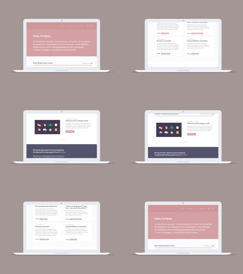
Personal Website WIP
Hello everyone!
I've never designed a personal website before, let alone one for myself so I am a little green and would appreciate any feedback you talented folks have. I have two versions attached, each with a different 'Work' section. Would looove to hear which one you prefer, the light or the dark?
I'm trying to keep it really simple. I have been noticing a little style pop up in my work that I have never seen before so I am letting that take hold and seeing where it takes me. I've been trying really hard to think less and do more lately.
Anyway, can't wait to hear your thoughts. Thanks for lookin'! :)
P.S. This shot has been wholeheartedly inspired by one of my favourite Dribbblers, @Axel Herrmann and his seamless scrolling screens. Not as great but I thought I would give it a go :)


