More Dashboard Explorations
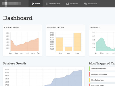
Exploring more design options for this marketing dashboard. I tried moving the navigation to the top, because the left bar felt too heavy. Also working on refining the visual style, and trying to push myself out of comfortable areas.
Charts are screenshots of Chart.js (http://codepen.io/marcelosomers/pen/wsita), not rendered in Photoshop.
Looking for feedback on the style of the boxes and how the white/gray works. Does it need more contrast?
More by Marcelo Somers View profile
Like

