Drawer
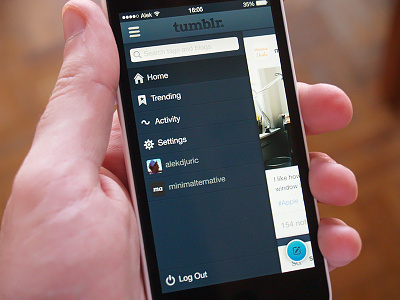
Posting different solution for the side menu.
Goal was to provide more space for the actual content, so that's why I removed tab bar and transformed it into a 'drawer'. Also, I think search is something that's implemented better. You can search for blogs and tags anywhere in the app, it's not a separated functionality like in the current version.
Peace.
More by Aleksandar Đurić View profile
Like
