Mood Board (1 of 2)
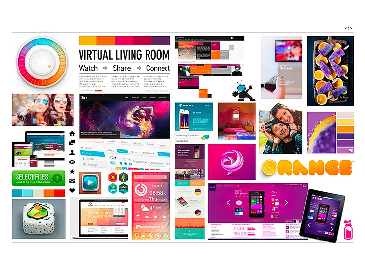
There was just something about this one, the orange/purple/fuschia – it helped expand the client's sparse brand color palette. I saw many possibilities coming from this board. Happily the client did, as well, and chose this one of the two. We referenced this board many times throughout the project.