SYAN

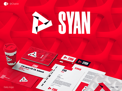
SYAN would be a workout/gym club, a little everywhere in Italian and Spain.
They main message would be very focused: strength and energy. Energy, energy, energy. And I thought that choosing that pinkish vibrant red would clearly communicate it.
Then, the background pattern would be used to communicate modernism, if not futurism. It is really clean, so that is why.
Thanks again to @sehban-ali-akbar (yeah, again) for his incredible set of stationery mockups.
This is highly inspired by @Rubendaems. Please go and check his works. It's like this, but much, MUCH better.
What do you think about this logo? I'd really appreciate your thoughts and feedback about it!
Contact me to establish a strong and unique visual identity for your business 💪