Re Frame Footer
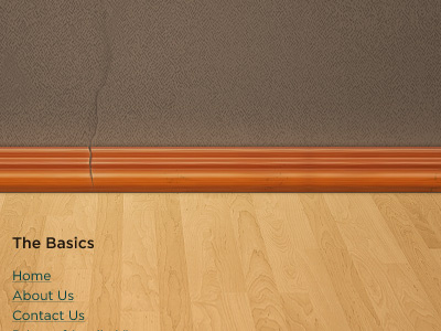
This snippet illustrates the footer of a fluid web design concept I recently put together. You can view the full concept here: http://goo.gl/SR1a8.
As a browser window is resized the frames would shift around to fill the space, which is great for mobile browsing. Each picture frame is also fluid and can grow vertically and horizontally depending on the amount of content. This particular organization has numerous sub-ministries, so this concept is intended to introduce visitors to all their offerings. :-)
More by Heath Gerlock View profile
Like

