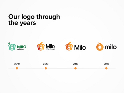
Milo's logo evolution
10 years have passed like one day!
Over the past decade, our logo has undergone a significant transformation. As for the colors, we started with green 🍏, then we turned into orange 🍎 - so it's fair to say that our logo matured with us like an apple!
We keep on growing, expanding our portfolio with new projects, taking new challenges, and drawing conclusions. 🎯 Despite the significant passage of time and many changes in our business, we have the impression that we are still the same company with a non-corporate atmosphere. The only thing that has changed is the fact that we are setting the bar higher and higher! Fortunately, we all jump over it together, regardless of position. 📈
Follow us: 👇
Dribbble | Behance | LinkedIN | Twitter | Facebook |
