Daily UI - 05: App Icon
In this 5th daily challenge, I had to create an app icon. Honestly, I don't enjoy making logos that much... It's cool when you have a really good idea and it just flows effortlessly out of your mind, but (at least for me) 9 times out of 10 it's a really difficult process which I don't particularly enjoy.
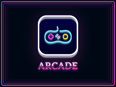
For this challenge though, I wanted to make something related to videogames in a 80's/neon/retro style, because it's a combo that I've always enjoyed seeing a lot and I wanted to give it a shot.
I started by reproducing a SNES controller. It took me a while to make it look as I wanted, but I eventually settled on a version I liked.
After that, I kept iterating over different design ideas and I had kind of a breakthrough when I started duplicating layers, set a small vertical offset and progressively reducing the opacity. That gave so much more depth to my work that I basically began applying it everywhere (sorry if it gives you a headache!) 😂
The final product is quite interesting. It's unlike anything I've ever done and it was for sure was an interesting 2-days design journey!
Hope you like it 😄