Epilepsy+Me App Prototype
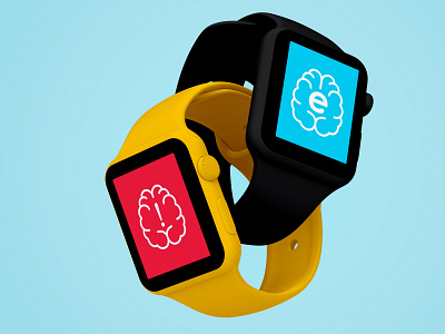


This project was an app design for people who suffer from seizures called ‘Epilepsy+Me.’ The goal behind this app is to help epileptic people remember when to take their medicine, when their appointments are and to monitor them when they have a seizure and call emergency services. The idea is to make living on their own easier for people who suffer from seizures. This app is designed to have a companion app that is on the Apple Watch. The logo's unique silhouette and simple design help to make it easily recognizable and memorable on small devices. A simple colour scheme that was chosen because for many people that suffer from seizures, using a lot of colours or conflicting colours tends to cause discomfort.
The Problem Space
Epilepsy is a neurological disability that many people have to live with. The problem is that many people cannot be very independent with epilepsy and this project is meant to try and solve that.
The Target Audience
The target audience for this project is people live with epilepsy. Approximately 331,000,000 people worldwide have epilepsy with 3,000,000 of those people being in the United States. This is meant to be useful to people who have epilepsy though it will be most useful to people who are between their teenage years and their sixties. These people will be old enough to have access to technology devices but young enough to be able to use these devices effectively and pick up on anything that may be new.
The User Research
The goal of this project is to help people suffering from epilepsy live independent lives. The people who use this will have concerns about living on their own. They would want to be able to manage their medicines and be able to get help when they are having a seizure.
The Solution
The solution was an app that monitored things such as their medication schedule and their appointments. It also comes with a companion smartwatch app that monitors their brainwaves so that it will be able to tell if they were having a seizure and alert their phone so that it would make a 911 call. From the user research, muted colours were chosen since bright and flashing colours can sometimes cause discomfort. As for the text and icons, they were kept simple and the contrast between them and the background was kept high.
