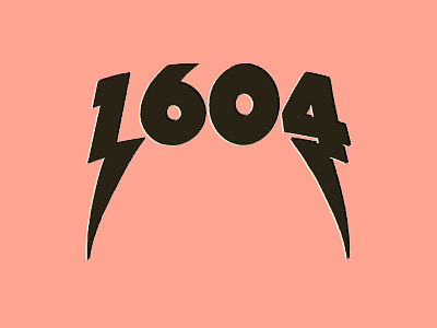
1604
My client wanted bold type and lightening bolts in the design which I found difficult to balance at first. Really happy that I stuck at it and broke through that part of the process where you think everything looks rubbish.
Looking at it now gives the impression that I've typed out a font on a curve and slapped some bolts on the end when that was definitely not the case! Not sure if it's a good or bad thing that it looks that way?
Anyway, I'm rambling on. Would love to know your thoughts on this one...
More by Lucy Llewellyn View profile
Like
