Overtone Brand Redesign
Introducing an uninvited redesign of one of my favorite products, Overtone.
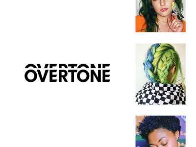
For those that are not familiar with Overtone, it is a hair-healthy, color-depositing conditioner that launched in 2014. We felt Overtone deserved a brand refresh.
This wordmark is inspired by the physical and emotional experience of altering your appearance. It represents the simplicity of the use of the product, as the layers of type illustrate the idea of achieving a more accurate version of you. 🌈
Check out the full design study at ds.link/overtone