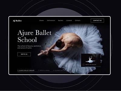
Landing for a Ballet School
The reason, that my first landing page as an assignment at our UX/UI course was dedicated to a ballet school, is that I am passionate about ballet and esthetic.
By researching ballet school web-sites, I made a decision to make a landing page with the core accent on visuality.
Lightness and smoothness of elements at my landing page create mood of flexibility and aesthetics.
Unfortunately, couldn't download the whole work, but you can enjoy the first screen of my landing page. Enjoy the shot and thank you for watching!
More by Alexa Bukharina View profile
Like
