Crayon IDE
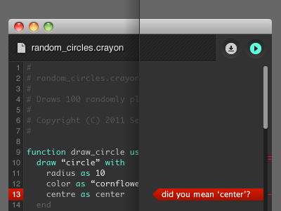
I took Paulo's advice and tied the save/run buttons more to the file, indicating that you're saving/running this document. I wasn't feeling the background of the button on the left, so I got rid of it and replaced the down-arrow icon with a file icon. Upon clicking the file icon, the editor will drop down and show a list of recent docs along with a button to open the file browser. I think it feels better—just enough texture and depth, not pushing it too far.

