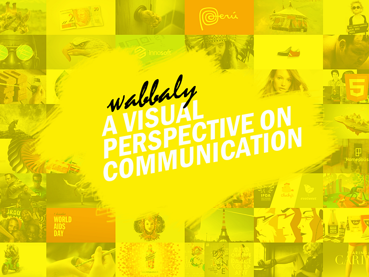
Wabbaly background , adding value
I wanted to add some value, to sustain the logo and the message "a visual perspective on communication". Focusing on the visual perspective, I've added the thumbnails of each post and a yellow layer overlay. Before: A visual perspective? You would see a white background After: A visual perspective? Photography, advertising campaigns, illustrations, showcases, branding etc All sustain the message
What do you think?
More by Sergiu Naslau View profile
Like
