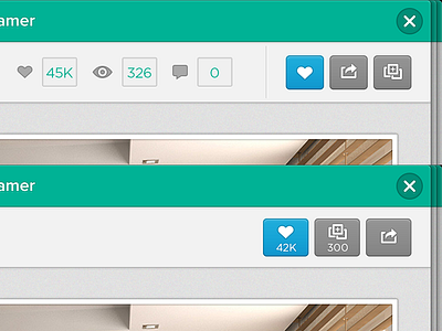
Obly - project info bar redesign
The original version of the project info bar (above) was a bit confusing. You had the amount of likes/comments on the left and the buttons on the right. We decided to merge these 2 parts together (below), saving space and creating clarity.
Full sized screenshot:
Project detail
More by Benny Chew View profile
Like
