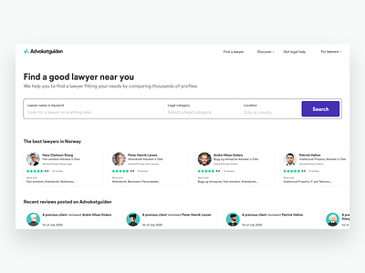
Advokatguiden - homepage exploration
After one year of process, multiple design updates and constant changes, we might have reached the peak of UX research for this platform. Well, of course with the constant addition of new features, it doesn't help to stay consistent when it comes to UI. But the cool thing is that I'm always pushed to question what I've previously done, and keep asking myself how I can create something that will last for a long time, without having to rebuild everything when we add a new feature.
The time you spend doing all these research in front of your computer, is the precious time you gonna save 6 months later when you'll implement new functionalities.
This project always remind me how tough User Experience is, and all the things you have to take in consideration when creating an interface. It might look easy at first, cause the UI you're interacting with is very basic and minimal, but it's also its biggest strength. Simplicity is the ultimate sophistication, as Da Vinci said.
Most of the designs you see on Dribbble aren't always UX proof, and what you get at the end on the actual website is far away of what came from the designer mind.
This sad truth applies for a lot of different jobs, when it comes to designing and then implementing/producing.
This is what I remember the most with Advokatguiden. And also, that I'm very unsatisfied with my previous design. Might post a new homepage design in 2 months, pretty sure it'll happen !
Don't forget to visit https://www.advokatguiden.no/en !
