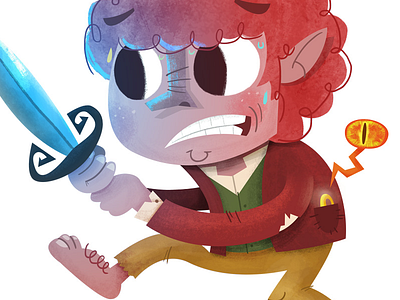
Bilbo - gif
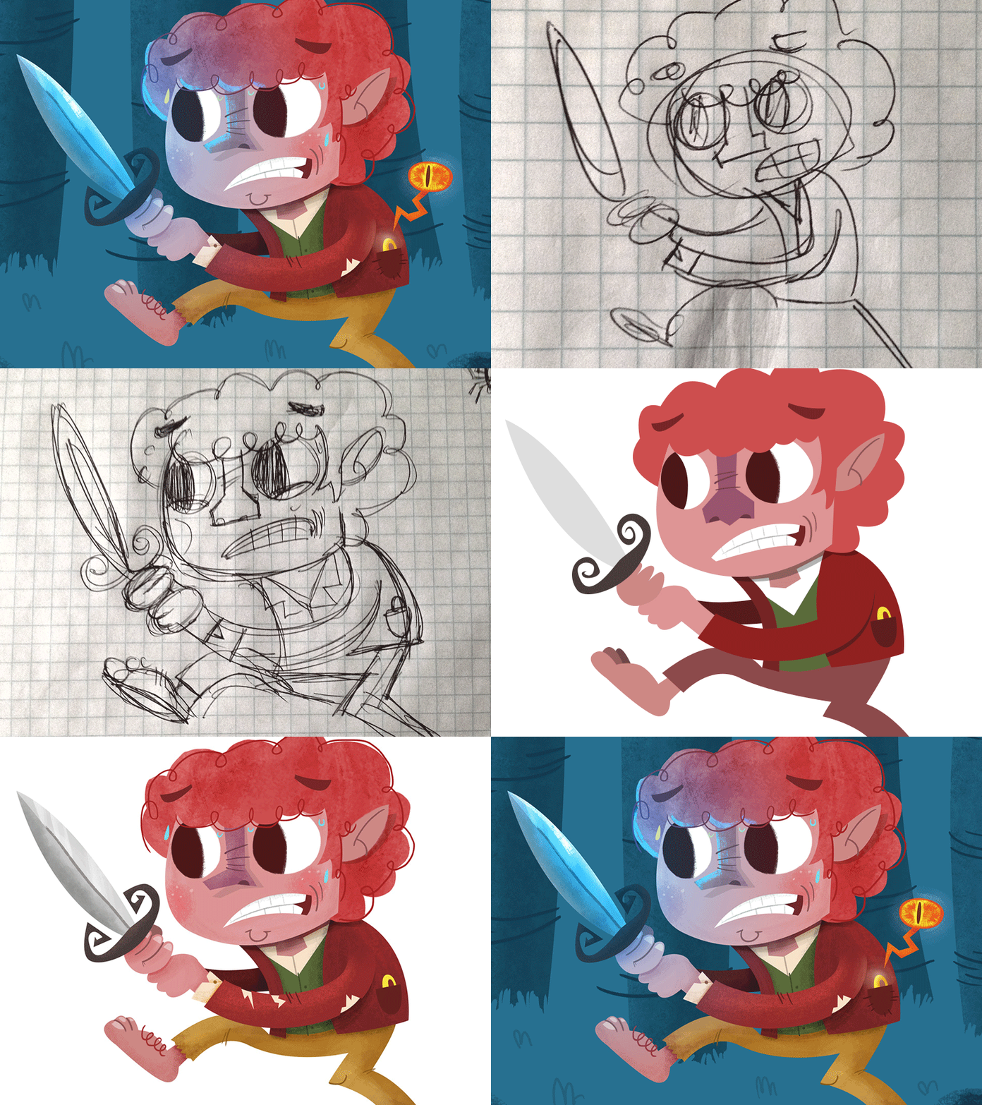
I want to talk about process a bit, as I don’t do that enough on dribbble. I work very organically most of the time, so the word ‘process’ is used loosely. I think about 72% of my life has been doodling. Not like amazing doodles that talented souls can bust out and then hang on the wall. Like ROUGH doodles (as you can see above).
POSE - As I was trained in traditional animation, it’s paramount to have a good pose. I use the rough sketch to convey the idea I’m looking for. Now what I haven’t posted were the 23 other super rough sketches that I did. I need it to feel right before moving ahead. As this was going to be Bilbo walking through Mirkwood, I wanted him to look scared and like he was sneaking quietly.
FORM - For this I typically use just a 2H pencil (I like it light) and some printer paper. This one was a bit different because the idea snuck up on me while at work, hence the graph paper and pen. I like to capture the main shape of the character, in Bilbo’s case it was really the face (with his big eyes) and hair that I was focusing on. He needed to look apprehensive, but still like he’s going to go through with whatever he’s doing.
Side note - I still can’t get away from physical drawings as a first step. I use a wacom tablet for rough sketches and for shapes/textures when working on illustrations, but there’s nothing like pencil and paper.
SHAPES/COLORS - This process takes the longest. Color is tricky, I love colors but sometimes struggle with finding the right ones. For inspiration I peep kuler or browse your work on dribbble. As for shapes, there is no easy way to get them right for me the first time. I change shapes A LOT. This is usually where I start breaking away from the sketch more and more (final work rarely looks exactly like the original sketch).
TEXTURES - These are tricky and I have been introducing them more and more in my work. For me, knowing when there are too many is still a struggle, but I’m getting there. I spend a lot of time just using the wacom and drawing in the shapes. Over and over. And Over.
FINAL - When I’m wrapping up and feeling good about a drawing I usually look at it, and tweak colors again, and introduce some more color if I feel that I want to. For this one I knew that I wanted Sting to glow, so I went in know Bilbo would have a slight blue glow in his face, which works well with his kinda earthly red color scheme.
Please note that this drawing came together very fast and from inception to final was pretty much intact to the way it was conceived. That RARELY happens that easily for me.


