TV Forecast Theme Take #2
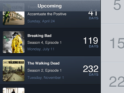
Made a few changes here:
- I've gone back to alternating the colour of the panels.
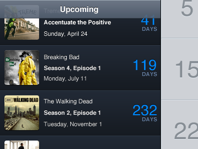
- The show name is bold, not the episode name.
- The bright blue number of days is gone.
- The section header has a grain on it.
Also note the way that it contrasts with the calendar view on the right.
More by mattcomi View profile
Like

