LotS Logo
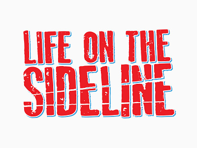
Here is the latest version of the logo I'm working on for a CT based punk band. The type is old, rejected letterpress letters that were too worn out to continue printing successfully. I digitized the stamped letters, then positioned the type so that "sideline" was most prominent. Then I added some breaks in the word "sideline" to make it feel damaged or frail, adding to the overall feeling of desperation in the typeface.
The client asked for a stroke to be added to give some depth and additional color to the image. Work in progress, but it's coming along