Daily UI - 04: Calculator
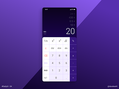
In today's challenge I honestly struggled a bit. For the most part I couldn't find a design and a layout that was working the way I wanted. Perhaps, I underestimated the difficulties of creating a calculator. It seems such a simple and trivial tool, but then something clicked. Since it's a well known object, there aren't many way you can structure the buttons in a unique way. Hence, it's really the colors and the little finesse that make it stand out from the other calculator apps.
Once I realized that, I stopped moving buttons around and started playing with colors, gradients and rounded corners. It still wasn't easy, but now I had a clear path to follow.
The final design is not groundbreaking or particularly inventive, but I reckon it's quite nice and I especially like the numbers slowly fading out in the screen.