366 Concept
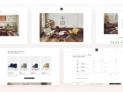
A classy website for classy furniture.
Elegant furniture requires an equally exquisite web design, especially if there is a one-of-a-kind story behind the brand and the product.
In the ’60s, the 366 Armchair designed by Józef Chierowski conquered the hearts of many Poles, but didn’t have the chance to gain international recognition. 366 Concept’s mission is to bring this masterpiece of Polish mid-century design back with the reissued collection of Chierowski’s furniture. This time, the furniture is aimed also to international customers, so creating a multilingual website with shipping to various European countries was a must.
Together with the client, we decided to divide the contents into two main parts for an enhanced customer journey on the website. The Discover section introduces clients to Chierowski’s designs and his most prominent piece, the 366 Armchair. The layout is inspired by a fashion or an interior design magazine – the symbol of style, luxury, and good taste.
The classic, paginated e-commerce product listing is enriched with sorting and filtering features that enhance the shopping experience. Products can be added to cart directly from this page, so decided shoppers can pick furniture that caught their eye and continue browsing without unnecessary interruptions.
Due to the constant growth of mobile e-commerce, today’s consumers expect an unparalleled user experience on mobile devices. To meet these expectations, we made sure that mobile shopping in Concept 366 store feels natural and unproblematic.
Check the whole project here ——— Thanks, hope you've liked it! Follow us to keep up to date with our upcoming projects. ——— Looking for a world-class digital product? Drop us line at hello@adchitects.co
