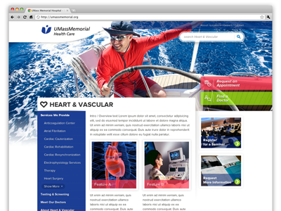
Heart & Vascular Microsite
Thought I'd share an early comp I worked up for a Hospital Microsite Homepage. Some features and colors were changed in a later version but this remains as my favorite. I wanted to produce something with a vibrant feel that wasn't the same old bland hospital website with navigation, content and calls to action. The goal was to convey not just a hospital that keeps people well, but an institution that offers folks vibrance and healthy living.
More by CentreTek View profile
Like
