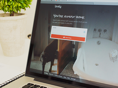
Lovely homepage
-= Tilted photo alert =-
Lovely got a facelift. Besides the facelift, this was a gigantic release. Briefly;
- Brand spanking new design language
- Tablet friendly experience
- Extraordinary speed improvements throughout the site
- New navigation structure and icons
- Much more streamlined search and alert creation (Now you can create an alert within clicks, that pushes a notification to your phone as soon as new listings appear on the map)
- New listing page layout, full screen street view (def check it out)
- Brand new Lovely Inbox concept (more on this later)
- And oh one last thing, you can now apply to rentals directly from Lovely! If you've been through an apartment search you know every time you need to apply, you have to fill in bunch of boring lines, referrals, etc. Now you can apply to a rental with one-click. This is my favorite feature update I think.
You will see a different photo each time you load the Lovely homepage. I took these photographs in random locations, mostly around San Francisco. You might even see my dog Lola in one of these photos. Check out different backgrounds.
I will be posting different interface elements later and talk about them individually.
Meanwhile, go check out livelovely.com in person and don't hesitate to give feedback. Team is crushing bugs as we speak.


