Addy Sign Up
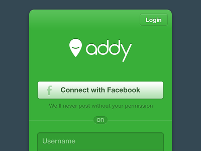

Working on an updated sign up/login page for our web app, and need some opinions. I've come up with two designs (see attached image).
In my opinion the green is more impactful as well as visually cohesive, however the white(ish) version allows for the standard Facebook blue button (more recognizable?) and is more visually neutral (good or bad?).
So, green or white? Cast your vote!