Monogram Option
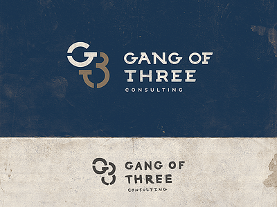

This option is simpler, safer, and a bit more corporate. One comment about the sketch was that the "G3" monogram looked a little like "GOO." on the final design I've shortened the top of the "3" in an attempt to fix this. do any of you have a lot of trouble seeing the "G3"??
Check out the 2x and attached and let me know! thanks guys :)