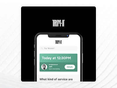
TRIM-IT x PAQ
TRIM-IT is one of the projects I get asked about the most, and I haven’t really shared much about the process aside from a few lectures or talks I gave.
Some of the inspiration behind the design came from shopify, spotify, airbnb, instagram + unsplash, which are some of my favourite examples of design and usability.
An interesting fact about the project is that when i first met with Darren Tenkorang — CEO of TRIM-IT — we expected the app to be not much more than 10 screens. while putting this mini-case study together I counted the final screens (not including test screens, or the design components) and it came out at 124 screens total.
I had already ‘known’ TRIM-IT for about a year-18 months before we worked on the design together through YSYS, an entrepreneurs community Darren and I were both part of but I think we only met for the first time to work on this. I also mention PAQ and I have to urge you to visit their website and look at their work, some of the best creatives i’ve ever met or worked with and everything they touch is just on another level. They deserve a tonne of credit too for this app design as the work they did to create such a cohesive, unique brand direction for TRIM-IT did a lot of the early heavy lifting and made my job a lot easier.
It works best as a carousel which you can check out on my Instagram at www.instagram.com/jamesfrewin
jamesfrewin.com


