DailyUI #023 - Onboarding
Hey Dribbblers 👋
This is my #023 #DailyUI design.
Design Hint 💻 - Design something onboarding related. Are you recruiting people for an organization? To sign up for a new website? A mobile app?
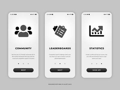
The Idea 💡 - The idea for today’s UI design is a set of onboarding screens for my theoretical Archery Community app for Android and iOS I came up with for my very first #DailyUI (and some that followed). This DailyUI will be a redesign of part of my first DailyUI I did a month back, for that UI I focused primarily on the Sign-Up screen and not necessarily the onboarding screens (they were more of an afterthought). So, I'm taking this DailyUI as opportunity to go back and properly redesign those onboarding screens! It's a perfect opportunity because from the previous DailyUIs I have designed for this theoretical app, I have solid colour palette and general design theory to go off of now. With that said, this design will hopefully fit in with my #006, #013 and #19 DailyUIs, better than my #001 - with neurmorphism, gradients and the monochromatic/noir colour palette.
Final Thoughts 🧠 - I love it! It looks much better than my [afterthought] #001 DailyUI onboarding screens! Typing this up now, its great to see what I so clearly have learnt in 23 days, I have applied what I have researched while designing my last 22 designs; it's paid off! The most obvious change was the colour palette, going from a more fun and vibrant palette to a more serious and sophisticated one, the change was deeply needed to fit in with my app's now confirmed colour palette. The neumorphic elements further followed the design theory of my last few UIs I have designed as part of this app, and makes the certain elements pop. The layout and typography have also had a drastic change for the good, with better sizes and paragraph fonts. The iconography has also improved, to a more detailed and eye-pleasing tone. Overall, with the redesign I have designed today, I am really happy with the result and am glad that I decided to take the opportunity to redesign this part of UI.
Share the love, press "L" if you ❤️ my work!
As always, I welcome any feedback! 😄
- Elliot
