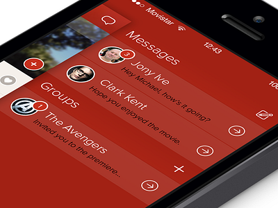
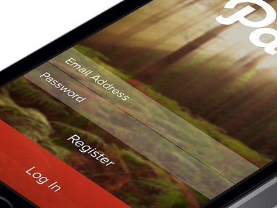
Messages - Path iOS7
and another :)
this one was a little more challenging as the amount of content visible depends on how many active messages the user has, it was important for me to maintain the same menu idea on this side as it was on the other menu.
in the current version of Path the top bar holds the title and compose buttons but with the new style this is trickier as there is no solid bar for those elements to sit. to solve this i decided to move the title down and maintain the illusion that it's on a title bar by aligning it to the main screen to its left.
real pixels attached and i would definitely look at them on your phone (if you haven't been doing so) :) so much better.
More by Michael Shanks View profile
Like


