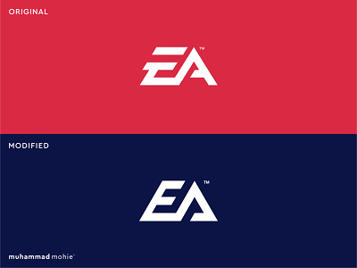
EA logo rebranding
My take on the EA logo rebranding!
I decided to create a light rebranding of the Electronics Art logo because the letter E in the original design is not only not readable enough but also it seems to be letter F!
Let me know what you think!
Looking for a stunning logo (re)design?
I'm open for new freelance projects.
Feel free to contact me.
More by muhammad mohie™ View profile
Like
