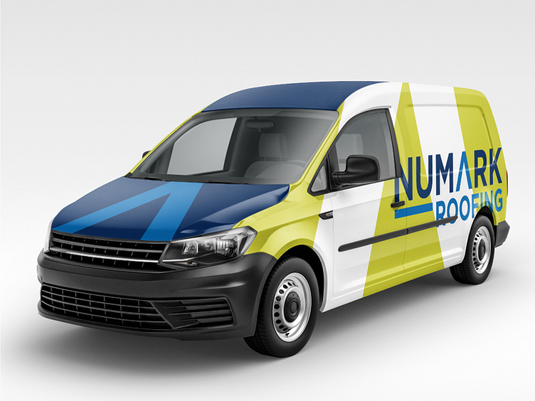
Numark Roofing logo design work van mock up
Does your logo violate my list of the top 3 problems in small business logos? Check the list at the end. . Fun with a cliche? Surely, an A has been used to represent a roof before. If/when it has been done before, I'd bet money that the "A" looks more like a literal roof than it does a legible letter. . This is a problem with many small, blue-collar business logos. They're always so damn literal. Often at the expense of legibility. Logos are for identification, not communication, so legibility is practically the most important aspect to me. . The original Numark logo didn't have this problem. No, it suffers from a different problem--the generic swoosh. . I had to completely abandon my sketch while working on this one. That A was so simple, I kept working on other stuff but it always felt like I was trying to do too much. . I almost finished it out with "Roofing" centered under the A (like it was being sheltered). But then that underline ran through to the K. I read it as NU and K being emphasized. Eureka! I'll just resize roofing leaving the emphasis on NU (new). . The 3 biggest problems in small business logos: 1. Weak legibility (often the symbol as a letter thing). 2. Generic swooshes 3. Human silhouettes (also generic swooshy "human" figures)
