5
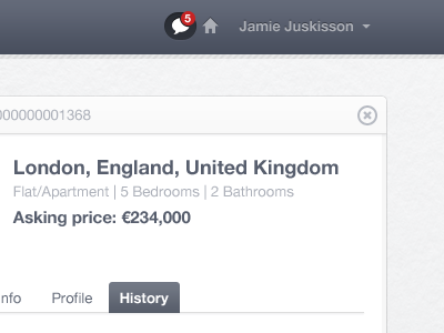
Message current state and unread counter.
I chose the "chat bubble" instead of a standard mail icon because in this case it's quite personal.
I also realize that the active state on here looks a bit odd, but it's in line with the rest of the site and it doesn't look that bad :)
Oh, and a typo on his last name. Lol.
More by Jonno Riekwel View profile
Like
