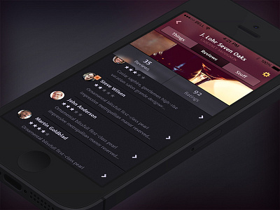
Iphone Wine App
Here's a screen of an iPhone wine app we've been working on. This is a single screen, that's why it's not showing a tab bar. We started some time ago before iOS7 was announced, and the iOS6 style design was really heavy in terms of layers, textures, gradients and drop shadows. We toned all of that down and tried to create a nice balance between an app with it's own branding with soul and style and on the other hand making it not stand out like a sore thumb in iOS7.
We decided not to go with just outline icons, 1px lines, zero drop shadows and gradients. We're quite happy with the way it turned out.
More by Yummygum View profile
Like

