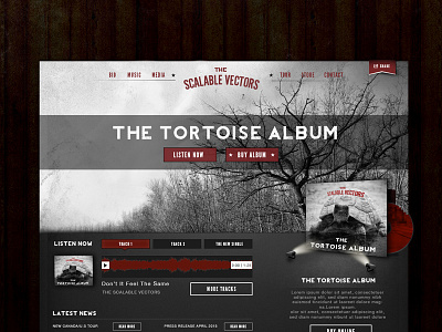
Web Layout for a Band
Full View Attached!
Shot Info
This is from a project that was never completed, but I still had the layout, so have replaced references to the band, album, and songs.
Main Aesthetic Goal
Their existing branding had lots of stars and went for a 'grungy' look, so I followed suit while trying to keep it with more modern (2012 at the time of creation) web trends.
Photography Credit
Shoutout to Meneer Zjeroen for being a part of the creative commons world and sharing his photos, which is where I borrowed both the tree BG and Tortoise image from. You can check out his beautiful photography here: (http://www.flickr.com/photos/nuskyn/).
More by Robin Bastien View profile
Like

