New Task Eater UI
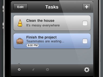
The main critique (UI wise) about Task Eater was that the colors are too less saturated and the UI needs more contrast.
So I reworked the colored tasks, and made black bars, instead of light gray ones.
This also looks better when you have a lot non-colored (gray) tasks in your list.
Update was submitted yesterday.