404 Error
Hi there!
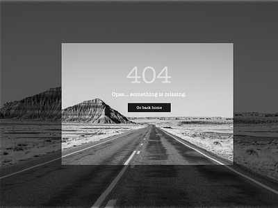
Today I designed a 404 error page as part of the UI Challenge. I chose to go very straight to the point, with the only necessary information, for the user to understand that needs to go back to the main home page.
I chose greys, blacks and whites, to make the user feels that it is the end of the road, there is nothing else to look at and better press the button "Go back home".
I hope you like this minimalistic design with very few info on the screen but very to the point.
Don't forget to press L, comment to say hi or something else... and of course follow for more shots to come!.
Thanks for your time! 😊
More by Maria Muga View profile
Like
