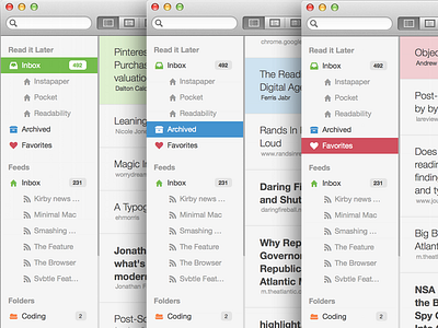
Redesigned Sidebar
While advancing towards our mobile version of Words, I took the chance to try a new approach on our dark sidebar. I wanted to adjust it to the new visual language in Mavericks (as seen in Calendar or Maps) and is used in iOS7. Additionally, I wanted to raise the readability of our sidebar & make it more friendly/easy on the eye. What do you guys think?
PS: Attached some screenshots for real life looks.
More by Sven Read View profile
Like


