Callout Ui design - Figma React UI kit


Callouts visually highlight important content for the user. In Setproduct Design System Callout component provided in several styles both for React & Figma: Filled, Smooth, Outlined & Raised. Use the desired style according to the priority of specific case. Filled style is more visible rather than Smooth or Outlined.
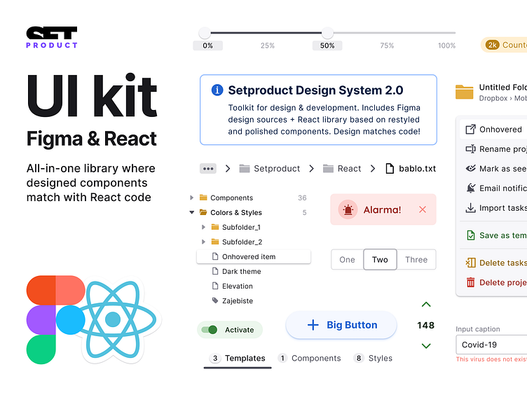
React-based UI toolkit for the web. Designed and well-organized in Figma. Optimized for building complex data-dense interfaces for desktop and mobile applications.
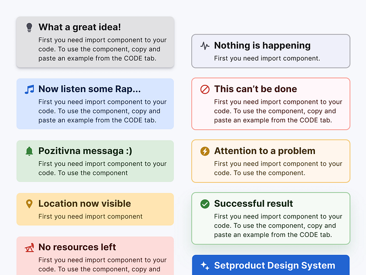
Callouts visually highlight important content for the user. In Setproduct Design System Callout component provided in several styles both for React & Figma: Filled, Smooth, Outlined & Raised. Use the desired style according to the priority of specific case. Filled style is more visible rather than Smooth or Outlined.
React-based UI toolkit for the web. Designed and well-organized in Figma. Optimized for building complex data-dense interfaces for desktop and mobile applications.
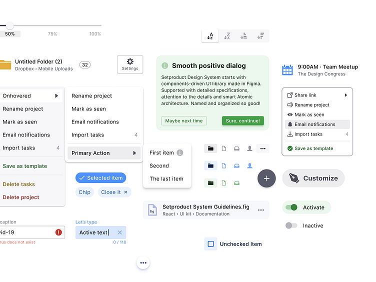
Callouts visually highlight important content for the user. In Setproduct Design System Callout component provided in several styles both for React & Figma: Filled, Smooth, Outlined & Raised. Use the desired style according to the priority of specific case. Filled style is more visible rather than Smooth or Outlined.
React-based UI toolkit for the web. Designed and well-organized in Figma. Optimized for building complex data-dense interfaces for desktop and mobile applications.
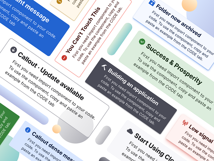
Callouts visually highlight important content for the user. In Setproduct Design System Callout component provided in several styles both for React & Figma: Filled, Smooth, Outlined & Raised. Use the desired style according to the priority of specific case. Filled style is more visible rather than Smooth or Outlined.
React-based UI toolkit for the web. Designed and well-organized in Figma. Optimized for building complex data-dense interfaces for desktop and mobile applications.