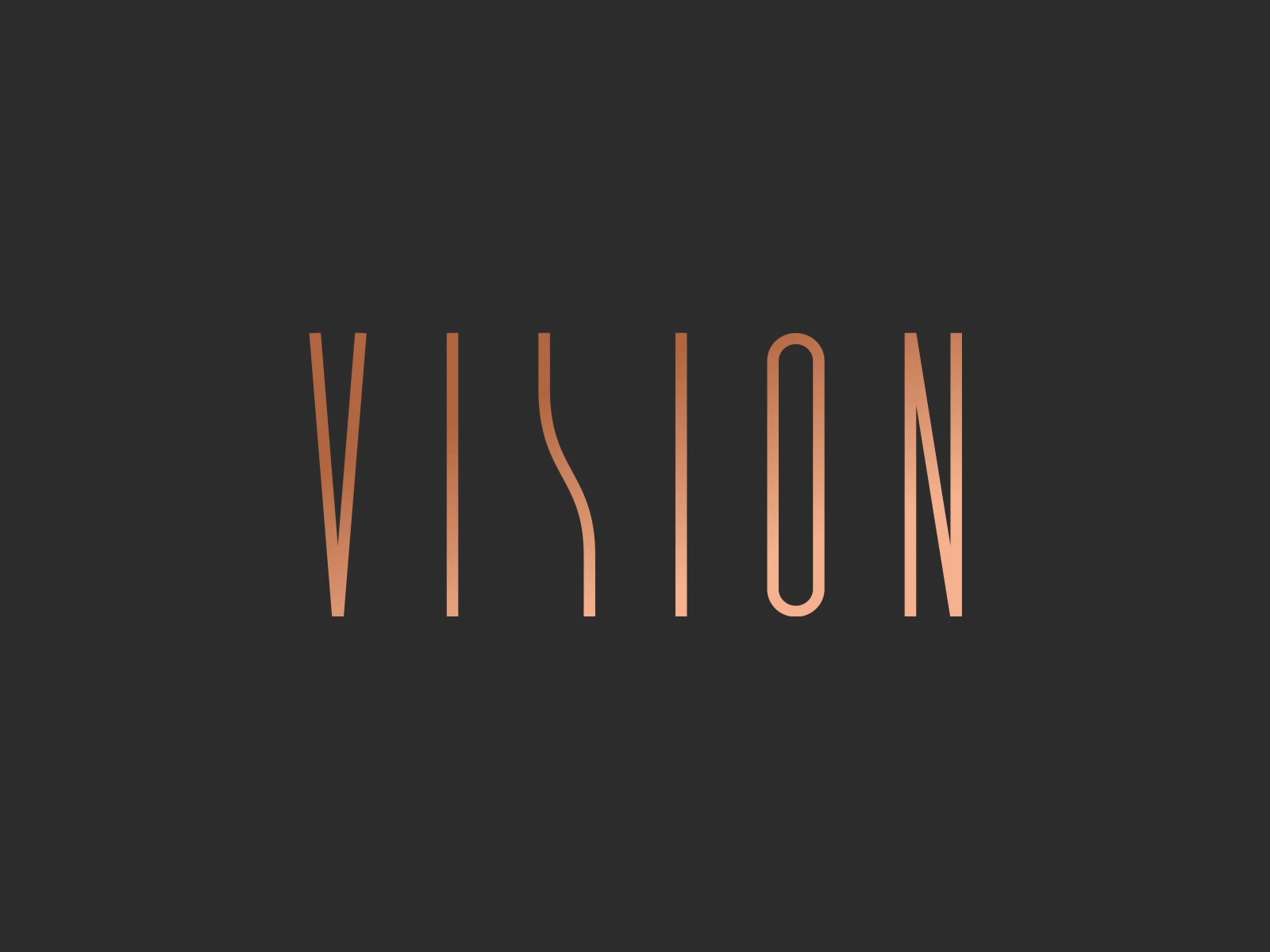
VISION - logotype


Creating brand’s visual identity was both: a huge responsibility, but at the same time one of the most rewarding tasks we’ve faced. The style of the houses was undoubtedly the biggest inspiration for us and from the first draft we knew that our main objective was to emphasise the elegance hidden in Vision’s DNA.
The logotype and typography, through simplicity and minimal nature, relate to the „look and feel” of the houses, and the colour scheme we proposed, featuring white, black and subtle copper accents, enhances the image of Vision as a premium brand.
Do you like it? Don't be shy, put some more 💚 (press "L")
Explore the full project on Bēhance
___
SYZYGY Warsaw − Digital Product Development Agency
We’re a friendly bunch
Let us know what can we do for you: warsaw@syzygy.pl
___
We’re hiring in Poland! Join the team →
___
Follow us for more stuff:
LinkedIn / Facebook / Twitter / Instagram / Bēhance
