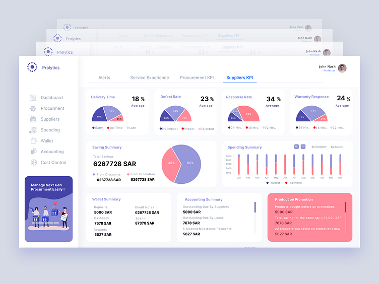
Suppliers KPI Dashboard - Work in Progress.
## UX Portfolio Case Study: Suppliers KPI Dashboard Design for Prolytics
### Project Overview
Project Name: Suppliers KPI Dashboard
Client: Prolytics
Tools Used: Sketch, Figma, Tableau
Roles: Business Analyst, User Experience Designer
Project Duration: 4 Sprints
This project aimed to design a comprehensive dashboard for Prolytics to monitor the performance of suppliers throughout the procurement process. As a hybrid Business Analyst and User Experience Designer, my role was to gather requirements, understand the procurement workflow, and design an interface that offers clear insights into supplier performance metrics.
Problem Statement
Prolytics needed a dashboard that could provide a detailed view of supplier performance to optimize procurement processes. The lack of integrated data visualization hindered strategic decision-making and operational efficiency.
Discovery Phase
User Research: Conducted interviews with key stakeholders involved in the procurement process, including procurement managers and financial analysts, to understand their needs and challenges.
Persona Development: Developed personas for the primary users of the dashboard, focusing on their roles, responsibilities, and how they interact with procurement data.
Information Architecture: Created an initial structure for the dashboard based on the insights gathered, ensuring that the flow of information was logical and met user expectations.
Synthesis Phase
Affinity Diagramming: Organized insights from user research to identify common themes around data accessibility, decision-making, and usability.
Requirement Gathering: Compiled a list of essential features, including real-time data updates, filterable metrics, and customizable views.
Ideation Phase
Wireframing: Sketched low-fidelity wireframes to outline the structure of the dashboard, including the layout of KPIs and data visualization components.
Prototyping: Developed a high-fidelity prototype in Figma that detailed the visual look and interaction flow of the dashboard.
Design Phase
User Interface Design: Focused on clarity and usability in the design, using a color-coded system to differentiate data types and simplify navigation.
Iterative Design: Conducted iterative testing with stakeholders to refine the dashboard, using their feedback to improve functionality and data presentation.
Final Design
KPIs Visualization: The dashboard visually represents various supplier performance metrics, such as average delivery time, defect rate, and response rates to RFQs.
Financial Insights: Includes detailed views of savings from promotions and discounts, budget versus spending analysis, and a wallet summary to track financial transactions between buyers and sellers.
Product Promotions: A section dedicated to tracking the performance of products under promotion, providing insights into cost savings and supplier efficiency.
Implementation & Feedback
User Testing: Continuous user testing sessions were held to gather feedback and understand user interactions with the dashboard.
Adjustments: Based on feedback, adjustments were made to improve data load times and enhance the filter options for better user control.
Conclusion
The Suppliers KPI Dashboard for Prolytics was designed to streamline the procurement process by providing a clear, actionable view of supplier performance. This project not only enhanced the decision-making capabilities of Prolytics but also served as a critical tool in optimizing their operational efficiency.
Future Directions
Plans for further development include integrating predictive analytics to forecast supplier performance and creating a mobile-responsive version of the dashboard.
Visit: For more information or to view the dashboard, visit www.himanshuuiux.com
