Pulpixel Logo Restyling
What about my logo restyling?
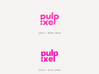
New version is more modern, with a better negative space balance and a better kerning.
The l's diagonal cut gives movement.
Used hotpink is slightly lighter and matte.
Work in progress
More by Giovanna Mastrocola View profile
Like
