The Mentor's Show Brand Identity
The idea behind the logo is to create a mark that is youthful and identifies with the purpose of the organization.
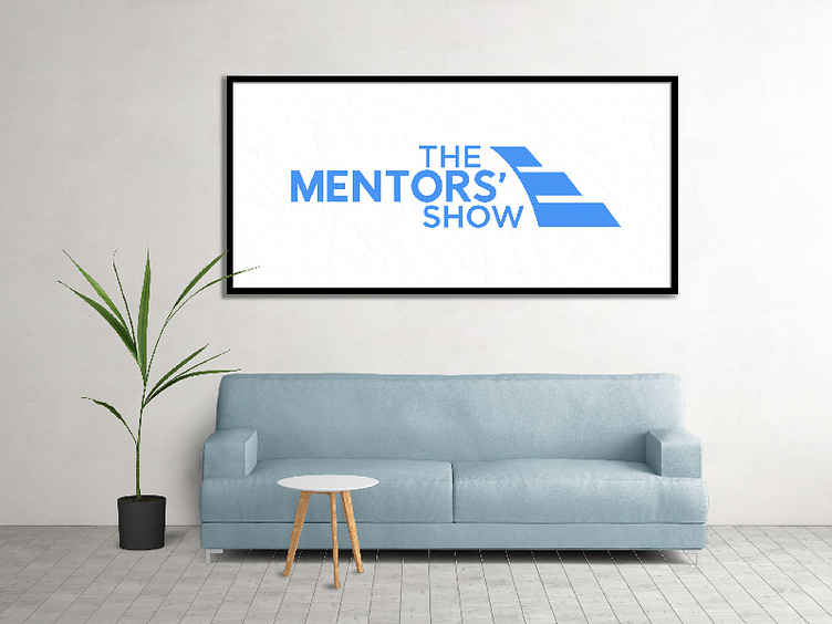
The logo mark’s inspiration comes from stairs. Stairs are made up of steps which depicts the stages and processes a person must go through before reaching the top of his or her career. Stairs give access, connection and also serve as means for something that is down to come up and vice versa. The stairs are made to be three steps to rhyme with the wordmark.
The wordmark employs two different sans serif fonts to emphasize the word "Mentor's".
Blue depicts leadership while white represents elegance
