Poster Tidbit
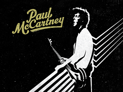
Here is a snippet of the poster. I wanted McCartney to look iconic and minimal while still being recognizable. Cut lines in the back are inspired by his dynamic piano paint-job while also resembling guitar strings.
Also, my dad took the picture that I referenced for the illustration. Mad props Pops.
More by Russell Pritchard View profile
Like
