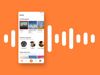
Soundcloud Mobile App - Menu Bar Redesign
Hello!
So, I do redesign for Soundcloud mobile app, especially the menu bar on the bottom.
I add the 'add button' in the middle of the bar to upload the track easily. I also add the profile navigation on the right and move the search icon to the top corner of the homepage.
Before the changes, the navbar only contains home, stream, search, and library. I asked several users of Soundcloud, they said it so hard to find their profile section and where to upload their own track. In the current condition, the file upload button and in-app recording feature are located differently (one on the homepage and on the profile page). However, it has the same goal that is to upload new track. So, I decided to add the 'add button' and the profile navigation in the menu bar for easier access.
Press L if you like it. Feedbacks are welcomed!
Thank you :)
