DailyUI #021 - Home Monitoring Dashboard
Hola Dribbblers 👋
This is my #021 #DailyUI design.
Design Hint 💻 - Design a home monitoring dashboard. Be creative! What would make a dashboard visually appealing and fun to use, while also being mindful of the data? Try to make it a realistic exercise as if it were your own dashboard... one that you need to refer to daily. What is the most relevant data and what's the most appropriate placement for it?
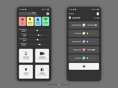
The Idea 💡 - The idea for today’s UI design is a home monitoring dashboard app for Android and iOS. The dashboard will encompass a fair amount of home usage data, including utility costs, temperature gauges with options to increase and decrease temperature, and multiple buttons leading to various other screens that show different smart connected devices and what not. The colour palette will be predominantly dark, with a "dark mode" theme running throughout. However, there will be scatters of colour throughout the app, too, to signify the appropriate utility. There will be elements of neumorphism embedded into the design, too.
Final Thoughts 🧠 - I really like what I've finished with! It looks fun, simple, minimal and functional, with lots of home data - which is exactly what I wanted! I went for a "card" design with this UI, mainly because I thought having the individual parts of the dashboard in their own little enclosed spaces would not only look aesthetically better, but also more functionally, too. I designed for wide accessibility in mind, with large input buttons and fair font sizes, which would be needed for an app of this nature since there would be a lot of people of varying ages in a varying amount of households using the app. While there is little colour in comparison to the dark nature of the colour palette throughout the design, the darkness really makes the small parts of colour pop, which makes for an eye-pleasing UI, which I like (It's my second favourite part about this UI). The temperature gauges with their accompanying sliders are my top favourite part of this UI, it's just the sliders! I designed them so that they can slide with "haptic feedback", so the end user will get tiny vibrations with every slide of a circle through the slider itself (if you can just imagine that). The sliders also have a neat feature of showing a Red or Blue bar either side of the "slider knob" depending on whether or not the current room temp is hot (which needs to cooldown) or cold (which needs to warmup) - after all, temperature doesn't change instantly! The right-side design is what the end user would see if they tapped on the "lights" button on the left-side dashboard design. Here you would find all your connected smart lights, with the option to dim, change colour and delete the light off the home network completely, oh and re-add it again or add a new one. The other three buttons on the dashboard would have similar connected screens, too. Overall, I am really really pleased with my design today, it has a lot of function with a lot of aesthetically pleasing elements, too - I'd say its the best DailyUI I've designed for, as of yet! Really chuffed with this one 😆
Hope you enjoy my work ❤️ - press "L" to leave a like!
As always, I welcome any feedback! 😄
Lastly, share the love by pressing the share button if you really like what you see! 👍
- Elliot
