Benchmark v.2
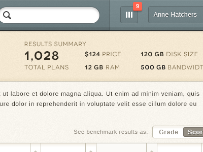
Second version and style for the same project. I decided to go with the cleaner, flat and lighter version, but I still like how this one turned out (specially the top bar).
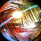
To select the colors of this design I used an Instagram picture I posted. I opened it up in photoshop, did a strong gaussian blur and "color picked" the tones I wanted out of it. Have done this for about two designs and always love how the color pallet turns out. Really recommend it. You will probably find tones that you would otherwise never find by yourself.