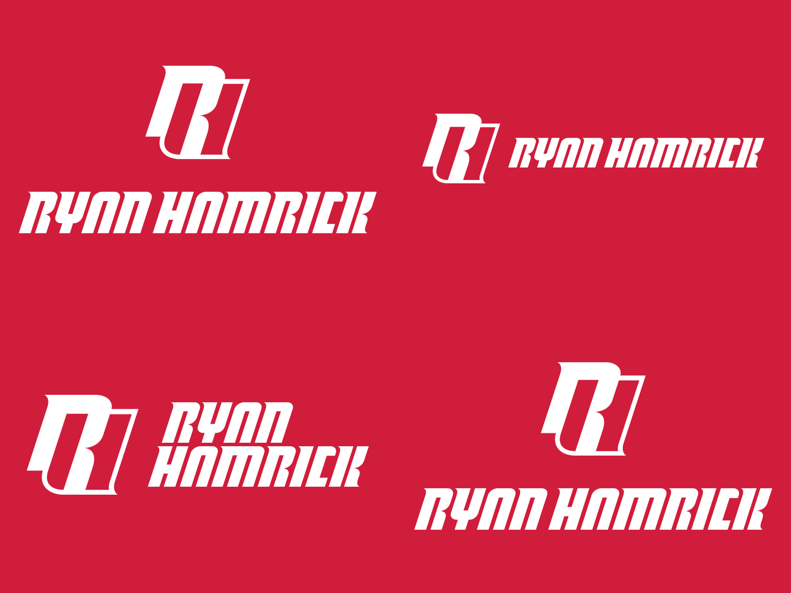
Personal Branding Lockup Options
I've slowly been redrawing the accompanying logotype for my RH mark in between projects, and I feel like I'm finally in a good place with it.
I'm curious what your general thoughts are on the lockups here. Specifically sizing and proportion? Does it work stacked? Is the color balanced enough? Are any of the little nuances to much? Any areas where there should be some, but there isn't?
Thanks for looking! 2x for a closer view.
More by Ryan Hamrick View profile
Like


