Spotify iOS7 - Re-imagined Discovery Flow @2x


Well, I was absolutely chuffed that @ericeriksson would take the time to comment on my last shot, showing a new discover interface, but he raised some good points about accessibility and distinctions of different 'categories' within the Discovery section.
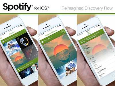
So, I've gone back and taken a look as to how it could be accomplished with more content on-screen, more options yet still usable. I think I might have achieved that aim.
This shows you the user's flow from Discovery to Album (the same could be achieved with any of the categories currently on offer).
Would appreciate some decent feedback, pointers or glaringly-obvious errors.
@2x for the larger thumb, or large pixels are attached.
Thanks for being a great community...I've had some sterling feedback so far.