Analytics Dashboard
The visual interaction between the user and the application is due to the elements used, which makes those who use it feel comfortable and focused.
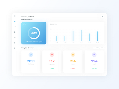
You are welcomed by the Overall Statistics consisting of your "Sales" and "Engagement" colored in gradient sky blue and the Analytics Overview consisting of information about your audience, each in different color making it eye pleasing.
You can easily change the dates by clicking the button located above the "Reach" tab.
To access the rest of the dashboard's functions, just use the menu on the left side which will take you to the desired destination.
More by Iliyan Iliev View profile
Like
