Schwartz
Hi guys! Here's some awesome client work from the summer that just got launched.
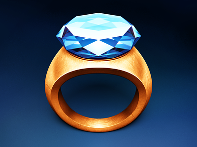
It's the app icon for a new app called Schwartz. You should check out all of the other sizes. I've also attached some renders of the 3D model that I used for texture mapping & perspective.
Normally I talk a bit about the shading/rendering of an icon in the comment, but this time I want to talk about an [arguably more important] side of the icon: the concept. The metaphor we developed is one of my favorites I've ever done.
Functionally, Schwartz.app is a wrapper for Apple's underlying Quartz technology–it's a bit of software that wraps around some more serious software to make it more beautiful and convenient. The icon, similarly, is a gold ring wrapped around a quartz crystal–it's a bit of jewelry that wraps around a more valuable gem in order to make it more beautiful and convenient to wear. A perfect metaphor!
Oh, and it's a Spaceballs reference in here as well, but I'm sure those who've seen them film have noticed already ;)
So, it works great on a metaphorical level, it's easily recognizable, it's original, plus it's got a bonus in-joke. I'm proud :D
Enjoy! And feel free to leave feedback or ask questions.


